NANA

|
December 2019
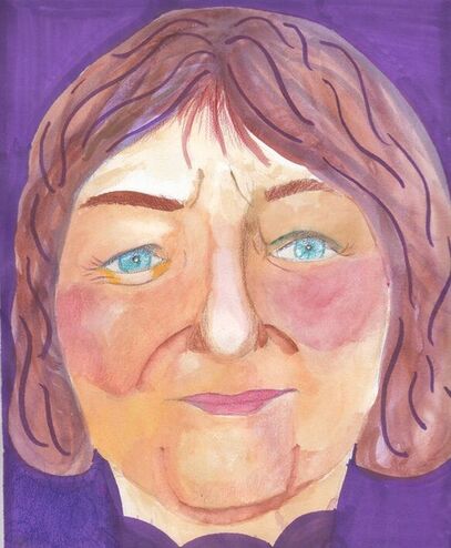
Colored Pencil and Watercolor on Mixed Media Paper 22.9cm x 30.5cm Nana is a watercolor portrait of my grandmother. This piece was inspired by Matisse's "Woman With a Hat" and Chuck Close's "Linda". This portrait was created to capture the essence of my Grandmother and highlight the happy, positive feelings I associate with her. I wanted it to show everyone the vibrance within her.
|
INspiration
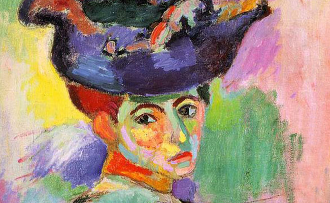
Henry Matisse "Woman With a Hat", Oil on Canvas (1905)
Matisse was the leader of the Fauvist movement and the main inspiration for the drawing. Matisse experimented with light and composition to “discover the essential character of things. I wanted to utilize this in a series of drawings, this being the first, using different sets of complementary colors to portray different moods. The complementary color theory inspired me due to how bold these color combinations come across. This piece was also stylistically inspired by realism. I wanted to recreate an accurate depiction of the proportions and dimensions of the photo so the addition of unnatural colors came across even more shocking. This drawing was meant to be pure experimentation with color and its effect on mood.
|
Chuck Close inspired the use of the grid method and the focus on the face in the piece. He would often do incredibly large scale hyper realistic paintings of people who were close to him.
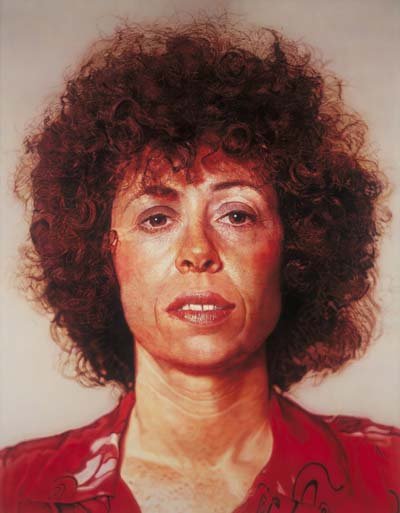
Chuck Close "Linda", Acrylic and Graphite on gessoed linen (1975-1976)
|
Planning
|
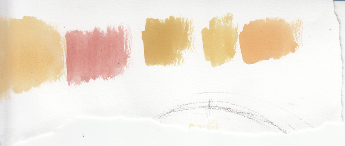
My first planning sketch was just to see how watercolor and maker mix together on a piece. The maker layers over the watercolor and with equivalent colors they mix well.
|
|
Process


I began by sketching a grid on both the picture and the final piece of drawing paper. The grid on the final drawing was 2 x bigger than the grid on the photo. Then I sketched out the face and erased all the grid lines. I went over the sketch with an eraser to lighten the lines.
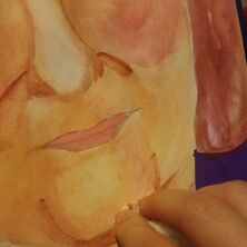
After cleaning up the sketch I went in with the undertones. The face had red undertones around the highlights and yellow undertones around the darker portions of the face. For the red undertones I mixed red, white and orange to create a more natural orange-red color. For the yellows I mixed yellow and brown to tone down the brightness of the yellow a bit, so it would blend more naturally later on.
After laying the undertones I mixed a skin color. The skin color consisted of yellow, red, brown and white with a very small amount of blue to balance the color. I put a light wash of the skin tone over the majority of the face and layered the darker areas to create shadows. For the very darkest parts of the face I mixed more brown into the skin to create full shadows.
After finishing the watercolor portion I went in with colored pencils to make certain colors more intense. I used a light pink around the blush areas. For the eyes I used blue and brown around the darkest shadow areas. I also did some light shading around the lips.
Finally for the background I used a purple prismacolor marker and filled in the background.
Experimentation
|
|

|
|
|
At some points in the painting I shaded the painting to dark. I learned you can lift watercolor with paper towel. Specifically on the chin I had put too much brown on the chin and needed to remove some. This technique was helpful but it lifted multiple layers of paint.
|
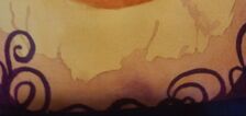
I didn´t know how to blend the face into the background. At first I tried a design but I didn´t like how it turned out. I then turned it into more of a neckline design as if her shirt was the same color as the background.
|
Compare and Contrast
|
Compare
|
Contrast
|
Reflection
My final drawing turned out almost how I envisioned it. The blending, shading, and color range was done to the best of my ability and I was proud of how it ended up. Redoing the initial sketch using the grid method to get the exact proportions of my face was the best decision made during this piece. If I were to do this drawing again I would focus more on slowing down the blending process, and letting the watercolor layers dry completely before going in with another layer. I learned midway through the drawing it is important to gradually layer the colors in order to blend them together. I also would change the angle of the face for the piece to make the final work more dynamic and interesting. I also would add more contrast into the background, the purple makes the work look flat.
ACT
Clearly explain how you are able to identify the cause effect relationship between your inspiration and its effect on your artwork?
Matisse inspired the idea of the piece which was mainly to experiment with color. I planned to create a series of drawings using complimentary colors to convey different moods.
What kind of generalizations and conclusions have you discovered about people, ideas, culture, etc. while you researched your inspiration?
Through my research I discovered why expressionists used simplification and distortion in their work. Expressionists wanted to bring feeling back to art and used certain methods to convey a feeling. The expressionism movement exaggerated a scene to create a feeling an artist wished to portray.
That is the central idea or theme around your inspirational research?
The central idea around my research was feeling and mood. I wanted to convey emotions of disconnection and sadness and my research was centered around art movements that utilized certain qualities to change the emotion behind a piece.
What kind of inferences did you make while reading your research?
The art timeline goes through phases of realistic and non-realistic renditions of reality. The type of art a movement portrays is based upon the culture and struggles of the time. Expressionism was a result of war and the before and after effects of it, so artists wanted to shop the emotions of the time.
