|
Segregated
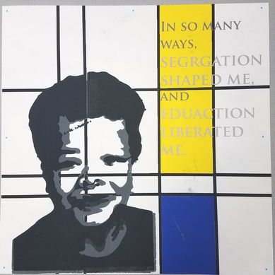
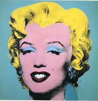
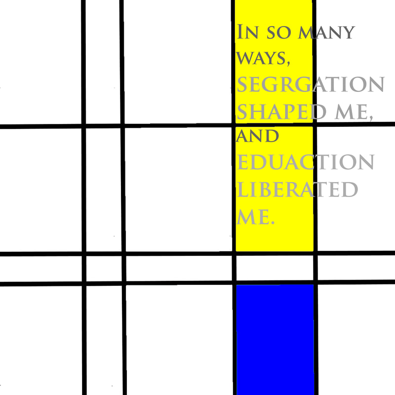
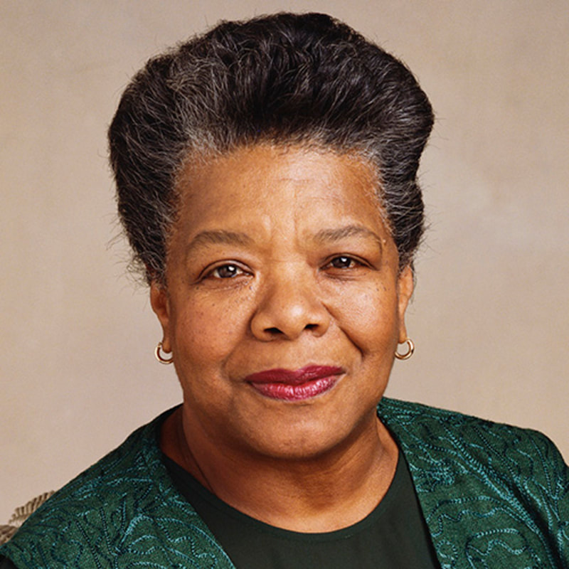
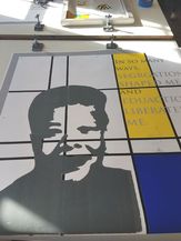
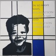
36"x 36" Multimedia November, 2018 Segregated is a multimedia piece inspired by Piet Mondrian's abstract city compositions and pop art's stylistic faces. This work shows the division of race in Milwaukee through separation of color with line. The face of Maya Angelou and the use of her quote are to show the connection between division and education. This piece shows the cultural division in Milwaukee blended within the culture of Reagan High School.
|
|
Cultural Inspiration
|
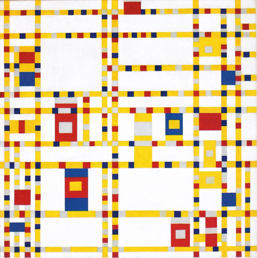
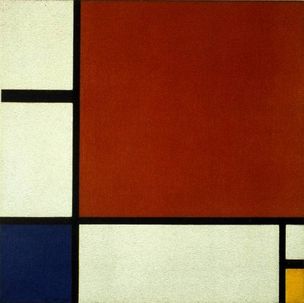
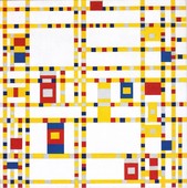
My inspiration for the background of my piece came from Piet Mondrian’s later work in the 1920’s. His most well-known works came from this era During this period his work had become completely abstract with a meaning that helped me show and say what I was trying to in my piece. In his later works focused on strong lines and vivid primary colors and “asymmetrical composition”1. In his work Mondrian “captured the essence of cities,” and “showed life within the city.” This work aided in the development of my idea to capture the background and feel of Milwaukee. Milwaukee and the greater Milwaukee counties continue to be one of the most segregated areas in the country. Mondrian’s idea to “capture the essence of cities,” was the exact idea I had. As one of the most segregated cities the lines of division are clear, and I knew one of Mondrian’s abstract maps would be able to accurately display the message I wanted to send. My two main pieces of inspiration from him were his Composition II in Blue, Red and Yellow, for the use of line and primary colors and Broadway Boogie-Woogie, for his inspiration behind the piece which came from the bustling life of New York City.
|
|
Planning
|
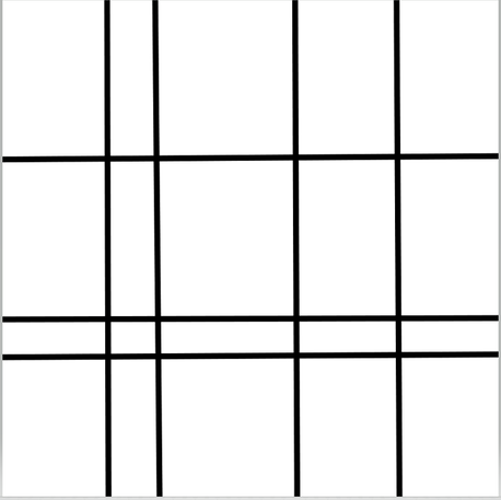
My planning sketches for this piece developed the thickness of the lines in the piece, the placement of the face and the use of words. My first sketch I tested thin lines with the face placed in the middle. In this sketch the background was lost to me.
|
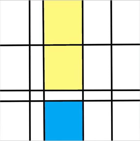
In the second sketch I increased the thickness of the lines and put the face outline in the bottom center. I made the lines too thick in this sketch and I still thought the face being in the middle left the background lost to the viewer. The last two sketched were almost identical but I was testing the colors I wanted to use in the background and the idea of the quote from Maya Angelou being a part of the piece.
Process
Background
|
|
|
|
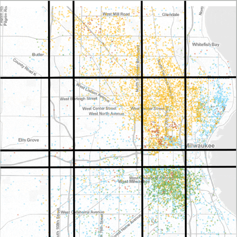
Beginning the process, I started with a map of Milwaukee with color to represent density of races in certain areas. The idea was to place lines on the clearest lines of division I could find along with lines on major highways (they correlate). I attempted to do this on three different computer programs: paint, paint 3D, and Photoshop. In the end I used paint because it was the simplest and most effective program to use. Creating and placing the lines was a simple process. The experimentation came in shifting the lines and deciding on the thickness of the lines. The idea was to make the lines prominent enough, so they were a clear part of the piece and showed the severity of the division, but I didn’t want the lines to dominate the piece and become the only focal point. I also experimented with the shades of color I filled the rectangles in with. I wanted the colors to be primary so the choice was between blue, red and yellow but the shades varied.
The final process went:
1. Opening a paint document and changing the size to 5000x5000pt
2. Pasting a map of Milwaukee and adjusting the size proportionately to fit the doc
3. Creating lines at every color division and major highways
4. Filling in the rectangles that correlated with areas of race majority with blue for African American and Yellow for Hispanic
5. Opening the document in photoshop
6. Adjusting the size to 36 inches by 36 inches
7. Creating a text box with the quote
Silk Screen Stencil

Stencil/Printing Process
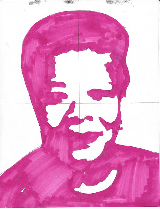
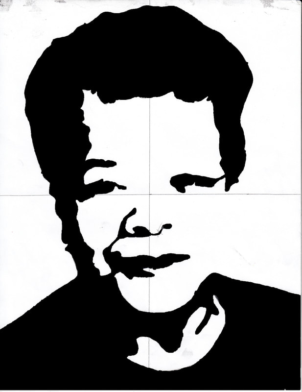
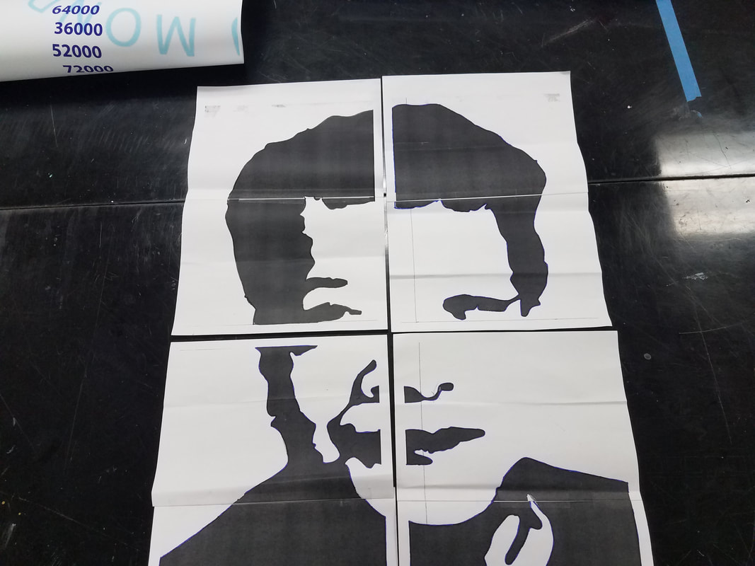
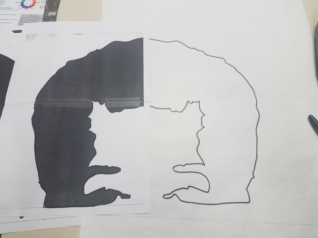
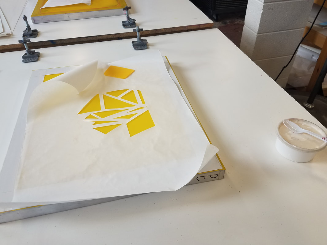
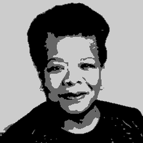
The stencil process started with picking an image of Maya Angelou. I picked 3 and tested them all in an app that transformed them to pop art style images. The app allowed for experimentation with clarity and detail in the image. The final image I printed onto a 8 ½” by 11” piece of printer paper. I then separated the layers of the image by tracing the gray inner details in the image onto one sheet of paper and the black outline another. I scanned the images onto the computer and opened them on a 36” by 36” photoshop document and enlarged them proportionally to the final piece. I struggled with the placement of the final stencil on the computer and how to print of the final image while keeping the proportions to trace onto the stencil paper. In the end I reopened the photoshop document in a paint document and printed them on a 5 by 5 grid. Once the images were printed I picked out my stencils arranged them back into the stencil and traced the image in 4 sections on freezer paper. I had to flip the images to trace them, so they would turn out right side up when printed. Once all 8 stencils were traced the actual printing process was done at MIAD. This process went:
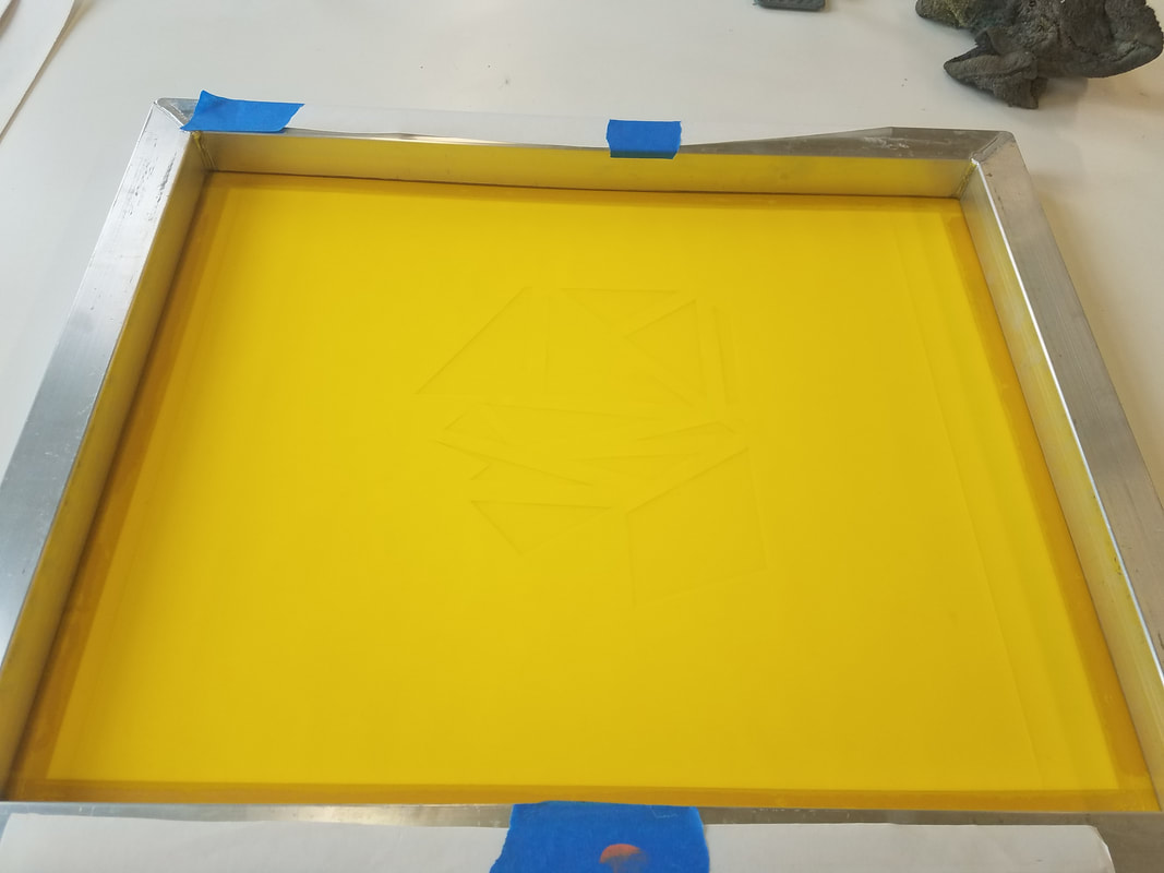
1. Aligning the stencil on the background
2. Placing the screen on the stencil print side up
3. Placing a bead of ink at the top of the stencil
4. Using the squeegee to spread the ink down the image
5. Lifting the screen, washing the screen, and repeating
Experimentation for the actual printing process was limited due to the time constraints of being at a different studio.
|
|
|
Experimentation With Pop Art Style
|
Experimentation was done varying the clarity of the image and the level of detail keeping in mind small details would be difficult to attain in the screen printing process and the piece would be viewed from afar.
|

|
|
|
Reflection
|
Compare
|
Contrast
|
My final piece turned out as expected but not as I hoped. The major issues came in with the screen printing process and the added quote which was meant to bring the message together but ended in distracting the viewer from the art. I also should have scaled the map down more white spaces would have emphasized the focus of minorities in one part of the state. The screen printing process was personally rushed. Washing the screen wasn't necessary between changing stencils if the same ink color was being used but it was critical to my process since the stencils had to be precisely lined up to create a larger images. Failing to wash the screen in-between each print left my print misaligned and messy. From a distance my mistakes aren't obvious, but up close they are clear. If I was to recreate this piece I would take out the quote, resize the map before creating my lines for the background, and slowed down the printing process. I am satisfied with my final piece, overall in perspective to how it's going to be viewed it turned out well.
