|
History
|
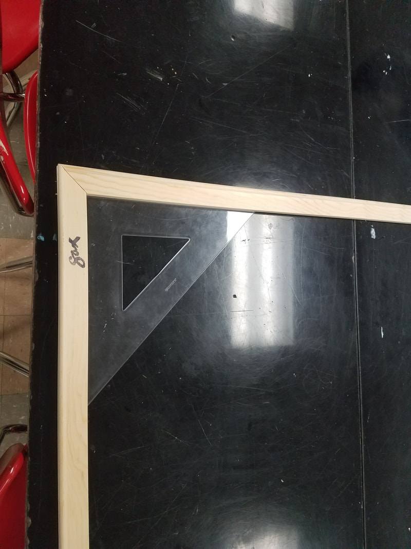
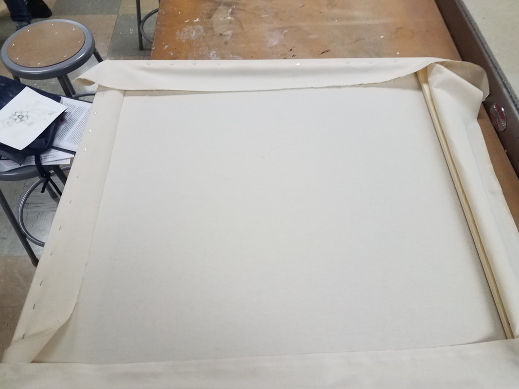
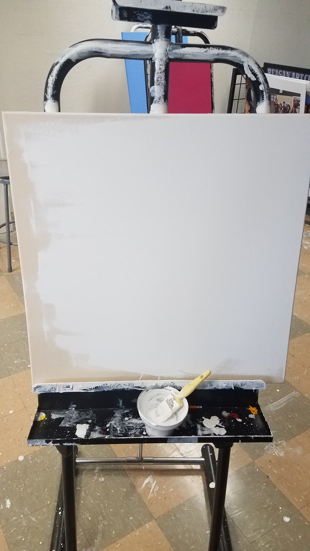
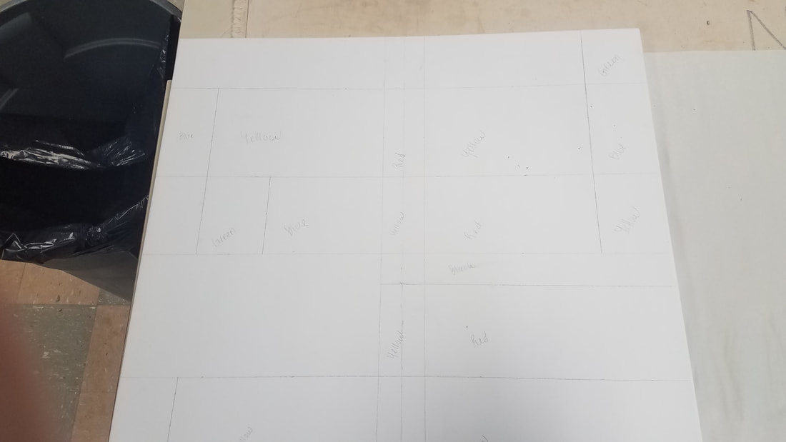
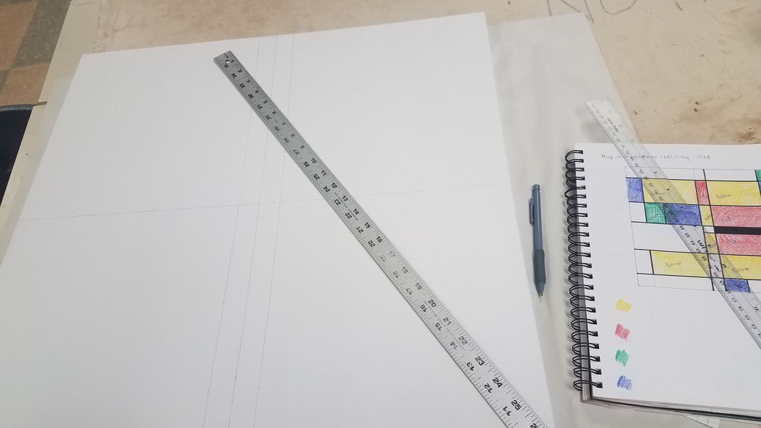
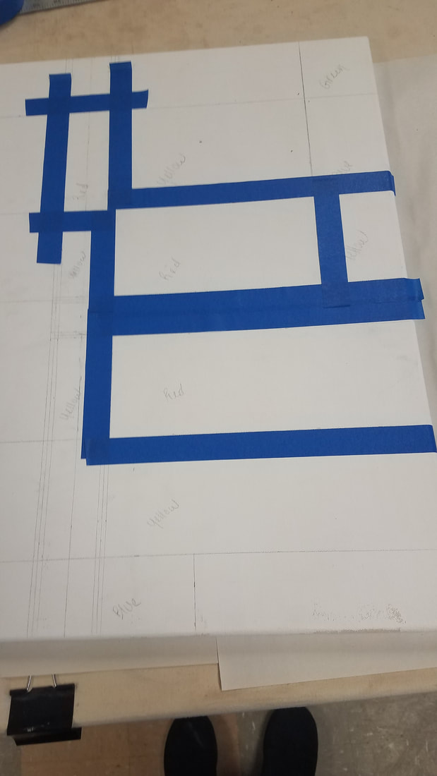
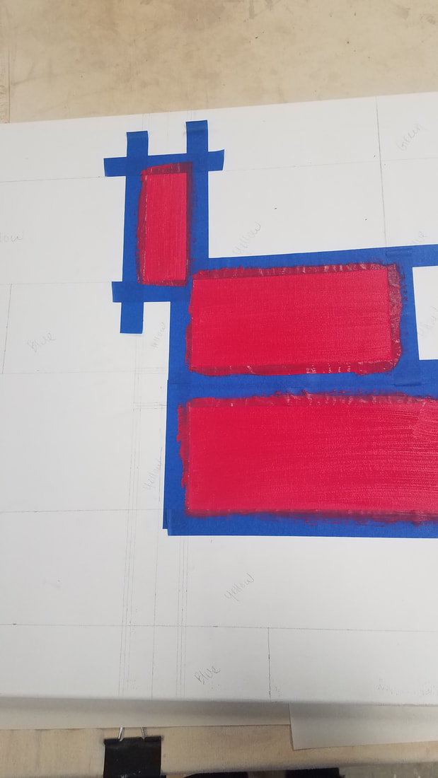
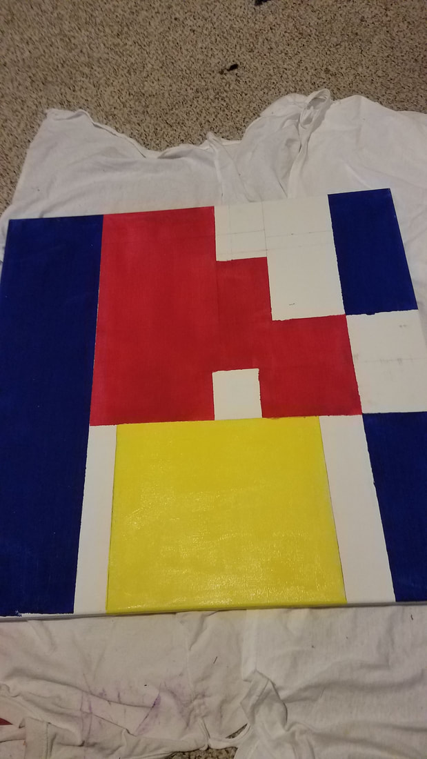
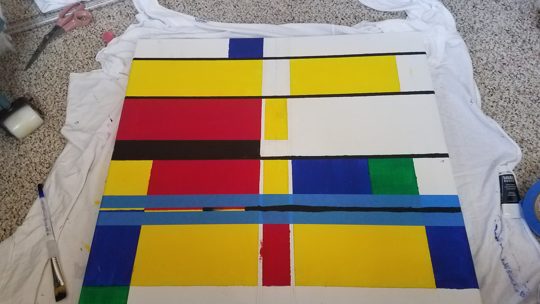
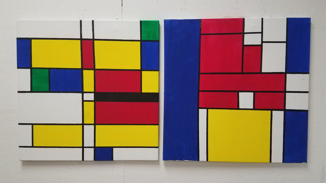
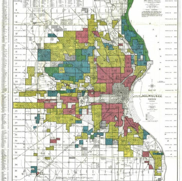
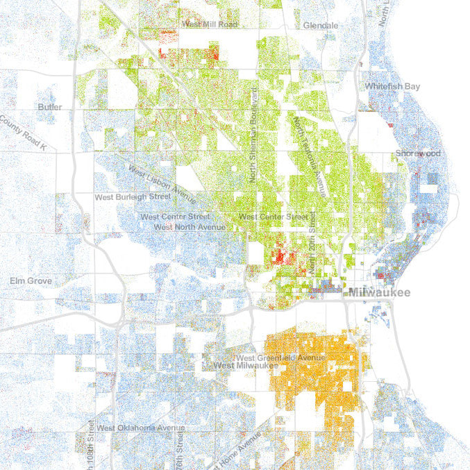
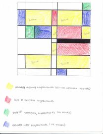
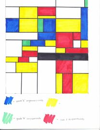
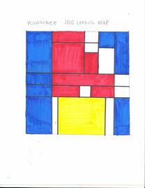
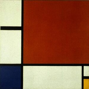
Inspired by Piet Mondrian, History is a two painting piece telling the story of Milwaukee through segregation. These paintings show the division lines created in 1938 during redlining and the lines that still exist.
|
|
History
|

|
|
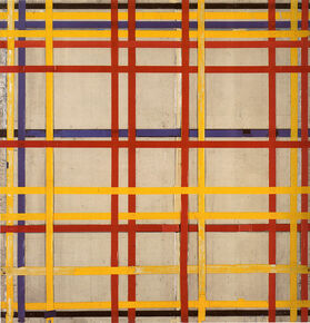
History was inspired by Piet Mondrian's neoplastic era paintings. His work during this time focused on strong horizontal and vertical lines, vivid primary colors, and large white spaces. His work had a "universal aethstetic" quality to it and an idea to "capture the essence of cities.
|
|
|
|
|
|
|
|
|

|
|
Compare
|
Contrast
|