Complemtary
|
ExhibitionOctober 2019
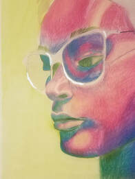
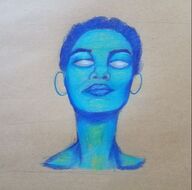
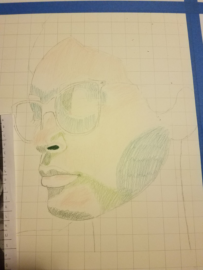
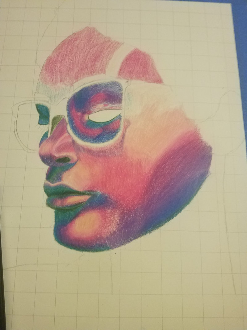
Colored Pencil and Watercolor on Paper 45.72cm x 30.48cm Complementary was inspired by the fauvist and realist movements. Matisse inspired this self portrait which explores how color can influence and convey mood. This drawing utilizes complimentary colors green and red to create a dynamic shade range that sparks visual interest. |
Inspiration
|

|
This piece was inspired by the fauvist movement and their experimentation with complementary colors. It was also inspired by realism style portraits.
|
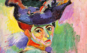
Matisse was the leader of the Fauvist movement and the main inspiration for the drawing. Matisse experimented with light and composition to “discover the essential character of things. I wanted to utilize this in a series of drawings, this being the first, using different sets of complementary colors to portray different moods. The complementary color theory inspired me due to how bold these color combinations come across. This piece was also stylistically inspired by realism. I wanted to recreate an accurate depiction of the proportions and dimensions of the photo so the addition of unnatural colors came across even more shocking. This drawing was meant to be pure experimentation with color and its effect on mood.
Planning
|
|
|

|

|
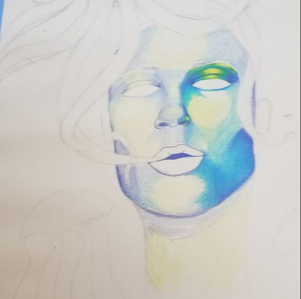
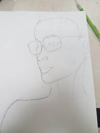
The planning for this piece was actually trial and error. There were two previous drawings that led to this final concept the two previous pieces utilized analogous color scheme and different perspective. After looking at my inspiration I realized these planning drawings lacked visual interest. These led to my final color pallet and angles. I also planned out the angles of the piece through various inspiration photos.
Process
|
|
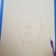
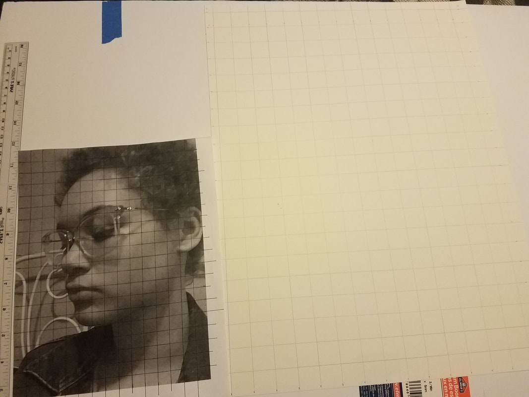
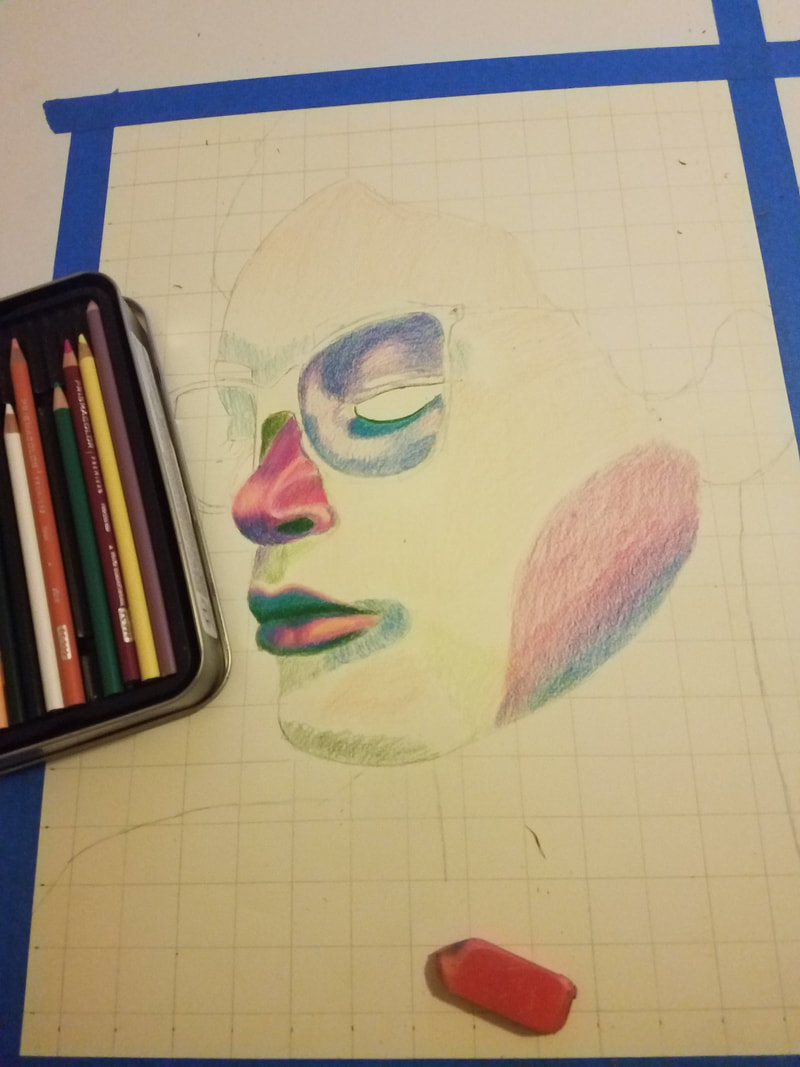
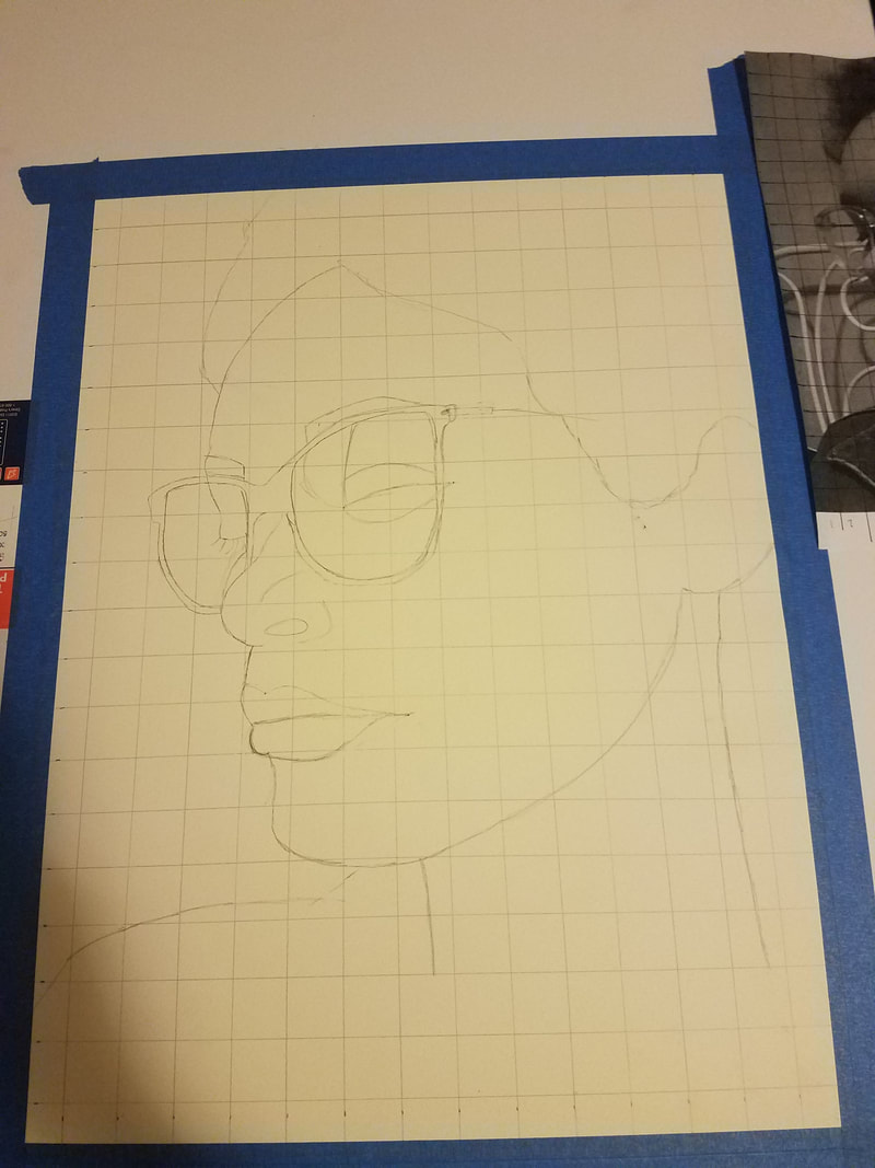
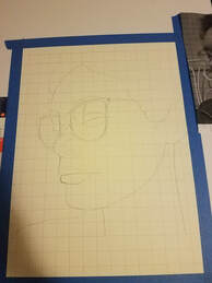
I began this piece by experimenting with lighting and angles to choose a photo that would become my final drawing. Once I chose a photo I sketched It out. I used the grid method to insure the proportions were exact. After I did the initial sketch I traced the final line work. After I finished the final sketch I started experimenting with different color pallets to finalize my color choices for the piece. My final choices were prisma colored pencils in the shades; 932 Violet, 1008 Parma Violet, 995 Mulberry, 994 Process Red, 928 Blush Pink, 916 Canary Yellow, and 915 Lemon Yellow.
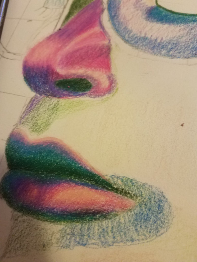
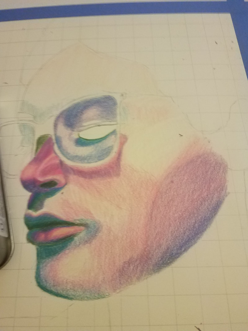
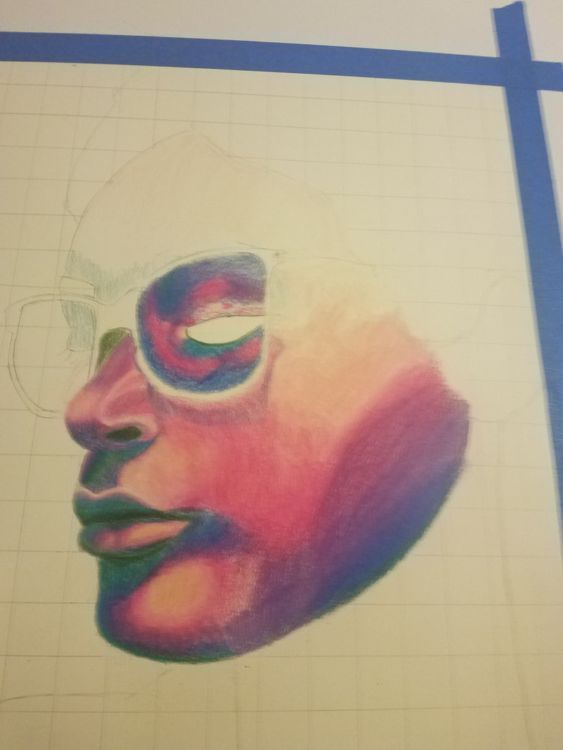
With my finalized color pallet I began to block the highlights vs shadows. For the highlights I used blush pink and canary yellow for the shadows I used .... and ..... From the blocked sections I started to shade in the most detailed/varying areas of the face like the nose, chin, lips and forehead. After I was done with the initial layer of shading I moved to the larger areas like the neck, hair and cheeks which required slightly less shading since there was less shadows and highlights. After I finished the larger areas I went in to the finer details and highlights. I highlighted the brightest areas with a uniPOSCA white paint pen. For the background I used watercolor in grass green to fill in the white space and tie the final piece together. |
Experimentation
|
|
I mainly experimented with color pallet and angles. For the color pallet I experimented with shade ranges and contrasting colors. I did not know if I wanted to use one color in multiple shades or two contrasting colors in multiple shades. I created shade ranges for each set of major contrasting colors on the color wheel, Red vs Green, Blue vs Orange, and Purple Vs Yellow. I ended up choosing Purple and Yellow due to the range of shadows vs. highlights I was able to get. For the photos I experimented with angles and lighting. I used different kinds lighting. I used natural and artificial light to experiment with the different shadows and highlights I was able to get.
Compare and Contrast
|

|
Contrast
|
Compare
|
Reflection
My final drawing turned out almost how I envisioned it. The blending, shading, and color range was done to the best of my ability and I was proud of how it ended up. Redoing the initial sketch using the grid method to get the exact proportions of my face was the best decision made during this piece. If I were to do this drawing again I would focus more on slowing down the blending process. I learned midway through the drawing it is important to gradually layer the colors in order to blend them together. I had tried the burnishing method with most of the piece but I applied to much pressure in the initial layers so you can see clear pencil strokes in the final drawing. I also would paint the background a darker green with a gradient that lightens towards the face.
ACT
Clearly explain how you are able to identify the cause effect relationship between your inspiration and its effect on your artwork?
Matisse inspired the idea of the piece which was mainly to experiment with color. I planned to create a series of drawings using complimentary colors to convey different moods.
What kind of generalizations and conclusions have you discovered about people, ideas, culture, etc. while you researched your inspiration?
Through my research I discovered why expressionists used simplification and distortion in their work. Expressionists wanted to bring feeling back to art and used certain methods to convey a feeling. The expressionism movement exaggerated a scene to create a feeling an artist wished to portray.
That is the central idea or theme around your inspirational research?
The central idea around my research was feeling and mood. I wanted to convey emotions of disconnection and sadness and my research was centered around art movements that utilized certain qualities to change the emotion behind a piece.
What kind of inferences did you make while reading your research?
The art timeline goes through phases of realistic and non-realistic renditions of reality. The type of art a movement portrays is based upon the culture and struggles of the time. Expressionism was a result of war and the before and after effects of it, so artists wanted to shop the emotions of the time.
